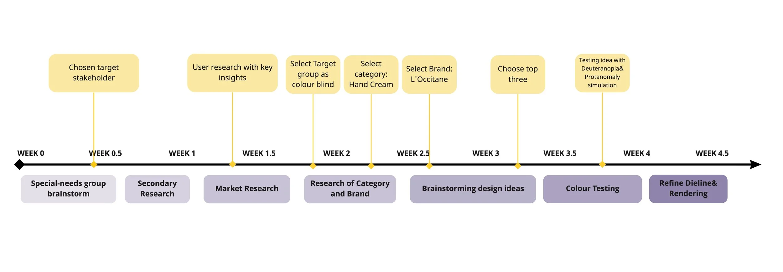
TIMELINE OF PROJECT
OUR TEAM
YICHENG WANG
Brainstorming special-need group
Research of colour blindness
Market Research with store check
Brand Research
Design visual ideation
Development of visual layout
Refine Dieline
Rendering
YING ZHONG
Brainstorming special-need group
User research
Summary of key insights
Market Research with store check
Secondary Brand Research
Design visual ideation
Development of visual layout
Colour testing
LIUZHU WANG
Brainstorming special-need group
Research of colour blindness
Market Research with store check
Chosen Category analysis
Development of visual layout
Colour testing
Rendering
CHOSEN TARGET STAKEHOLDER
The colour blind group
Colour plays a leading role in packaging because it helps to define the overall style and tone of the product. In addition, colour is a tool for distinguishing information about different functions. However, there is a segment of the population that loses the ability to perceive certain colours due to aging, genetic reasons or other diseases. Since this is a common invisible disability, we felt obliged to redesign the existing packaging to meet the needs of such individuals and help improve their shopping experience.
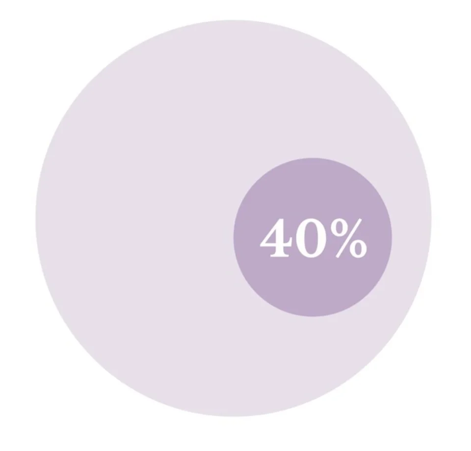
The average 80 year old has only 40% of the colour recognition ability of a 20 year old.
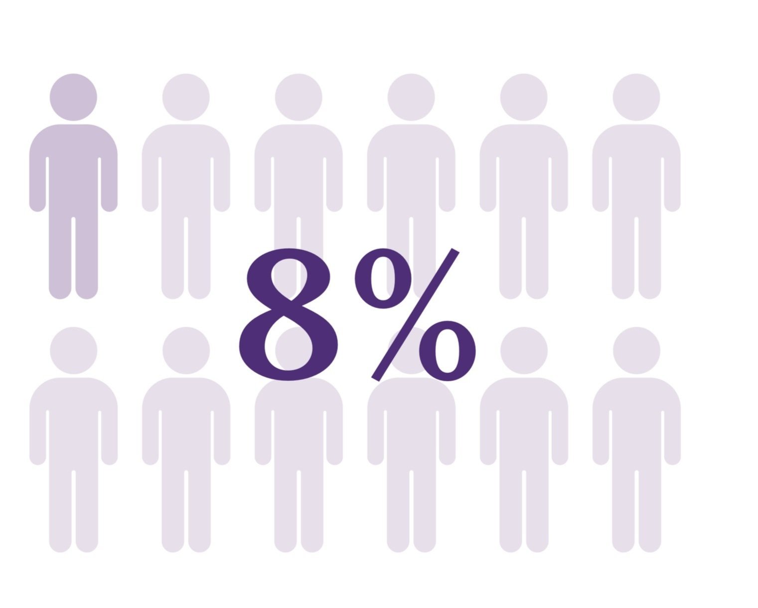
1 in 12 male are colour blind.
USER RESEARCH
Color blindness type research
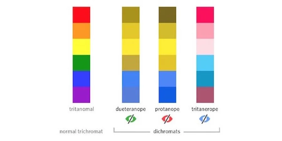
The Red coloUr blindness
Also known as first coloUr blindness. Patients are mainly unable to distinguish between red, red and dark green, blue and purple, and purple. Green is often regarded as yellow, purple as blue, and green and blue are mixed into white.
The green coloUr blindness
Also known as second coloUr blindness, sufferers cannot distinguish between Light green and dark red, purple and turquoise, fuchsia and grey, perceiving green as grey or dark. Clinical red coloUr blindness and green coloUr blindness collectively referred to as red - green coloUr blindness, more common. Color blindness usually refers to red - green coloUr blindness.
The blue colour blindness
With tritanopia, the colour blue looks like it is green, and the colour yellow looks violet or light gray. It is a form of colour blindness that is extremely rare.
KEY INSIGHT
Red-green blindness is the most commonly seen
When using two or more cool or warm colours, there needs to be a clear distinction in terms of brightness and saturation
Avoid using low saturation and low brightness colours Use less colour combinations as possible
Avoid using colour combinations such as red & green, green & brown, blue & purple, blue & green
Use shapes or textures on top of colours Use text to support illustration

MARKET RESEARCH: STORE CHECK
Personal care products
We believe that the lifestyle section is a category that all people will visit, and this category often has a wide selection of scents, so coloUr and pattern are key messages to differentiate between scents.
Groceries
The food area is the most colorful because the color can not only effectively distin- guish the taste but also stimulate the appetite of consumers. We believe that by redesigning the food packaging, we can enhance the visual experience and purchase interest of color blind people.
CHOSEN CATEGORY
Hand cream
We finally chose hand cream among our per- sonal care products, which is a category for all age and gender groups. Hand creams bring nourishment and care to our skin by being in touch with our body. We believe it is sensual to convey a tactile and physical experience through visual design. Besides, hand cream comes with a selection of scents which rely on visual information to differentiate while main- taining the consistency of brand identity. So we decide to redesign the hand cream packaging for color blind community for the purpose of more efficient and clear visual design.
CHOSEN BRAND

BRAND POSITIONING
L'OCCITANE EN PROVENCE is an international retailer specializing in the manufacture and sale of personal care products and household products, with its main production base in Manosque, France. The company preserved and carried forward the tradition of his hometown province, with the corporate philosophy of comfort and pleasure, authenticity and purity, care and respect.
BRAND USP
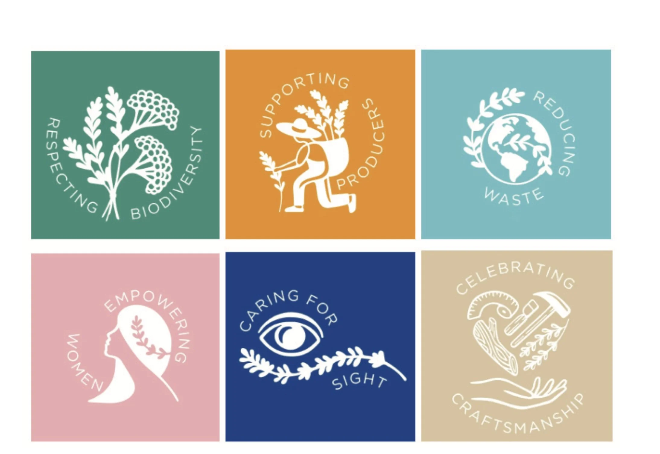
L'OCCITANE has six commitments: respecting biodiversity, supporting producers, reducing resource waste, empowering women, helping vision, and promoting craft and technology. Uphold the brand belief, respect people and the natural environment, actively invest in the protection of endangered species, assist in the inheritance of local traditional technology and other programs
TARGET CUSTOMERS
L'OCCITANE brand user groups cover 20-65 year old women, it also targets men as it has a men range. Our target users this time, in addition to L'OCCITANE's brand promise to save the blind action, help the visually impaired people in the coloUr blind group to upgrade the brand packaging.
L'OCCITANE Caring for vision
The L'OCCITANE Foundation has been dedicated to the fight against eye diseases and blindness, and launched the L'OCCITANE Project for the Blind. L'OCCITANE has launched a product line featuring braille logos, from most products, to help blind and visually impaired people choose products.
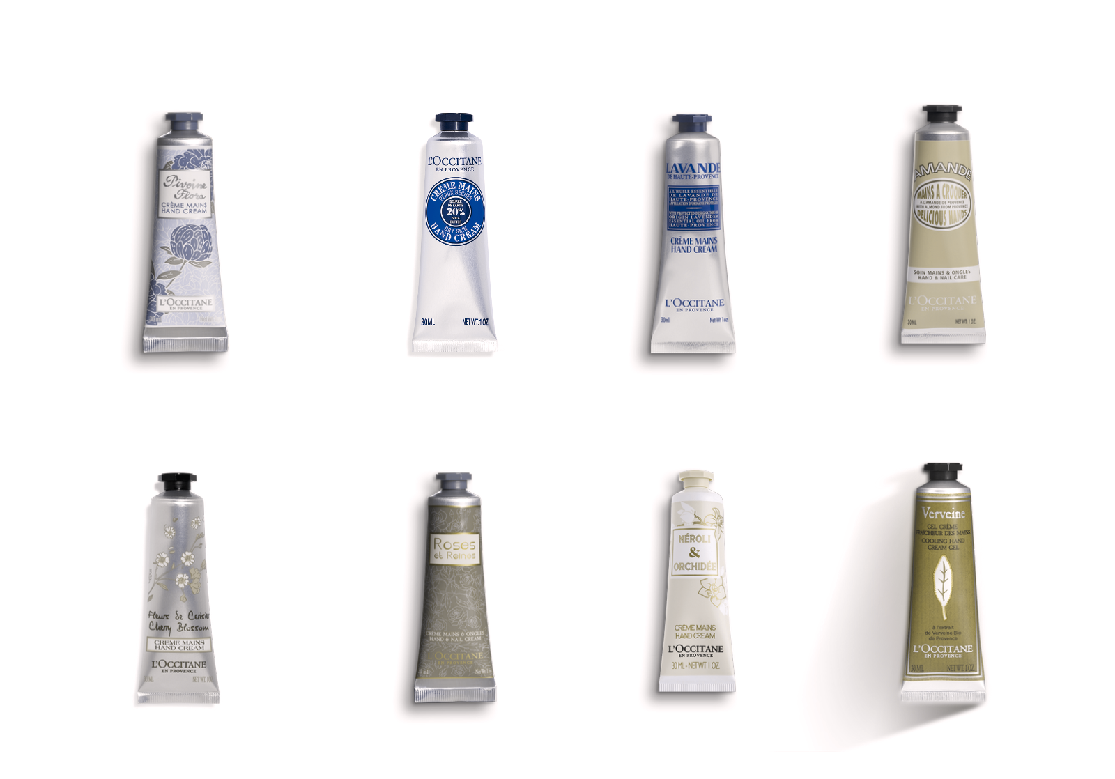
CHOSEN SERIES
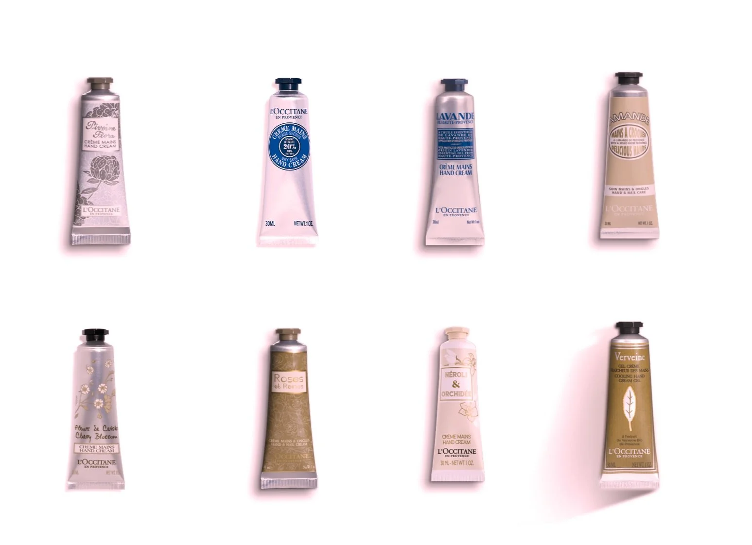
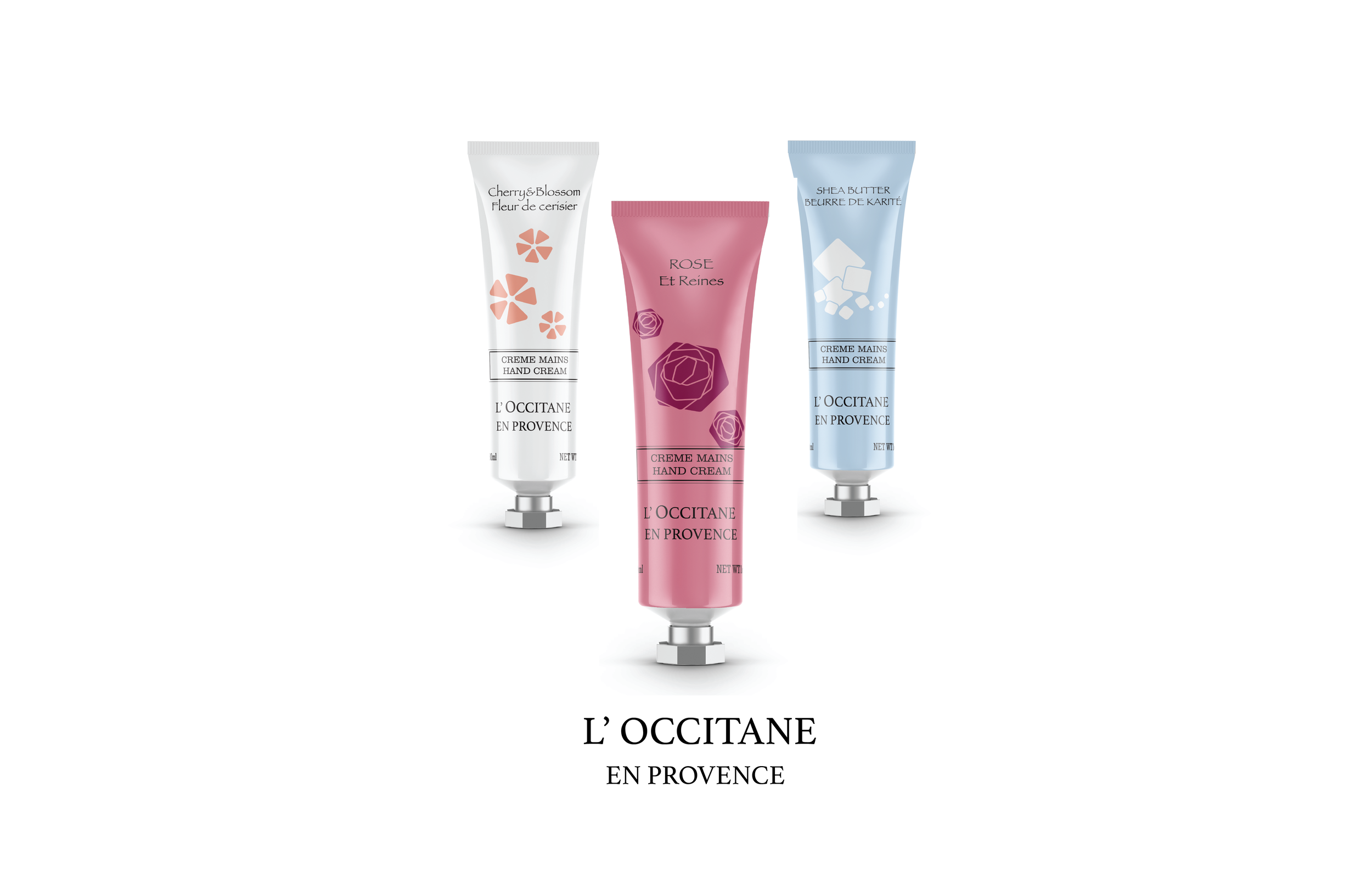
Classic hand creams were chosen: Pivoine Flora, Shea Butter, Cherry Blossom, Rose, Lavender, Almond delicious, Verbena Cooling, Néroli & Orchidée. The brand emphasized the "art de vivre" (art of living) so that this collection has a lot of natural flavours from the south of France, Africa and the Mediterranean coast; the patterns from the package were transferred from the forms and colours of the natural plants/flowers
Simulation of Protanomaly
Simulation of Deuteranopia
DESIGN IDEATION
At the initial redesign stage, we focused on the graphic language to communicate the scent of each. Learned from previous research, we tried to use shapes on top of colour, along with text for further clarification. In light of the choice of colours, we intended to use as less as colour combinations and increase the contrast between content and backgroud. Among all the sketches, we decided to further refine the above one as it appealed to us for its strong and clear geometric style. In next phase, we will work on some variations based on this sketch as well as tests more colour combinations.
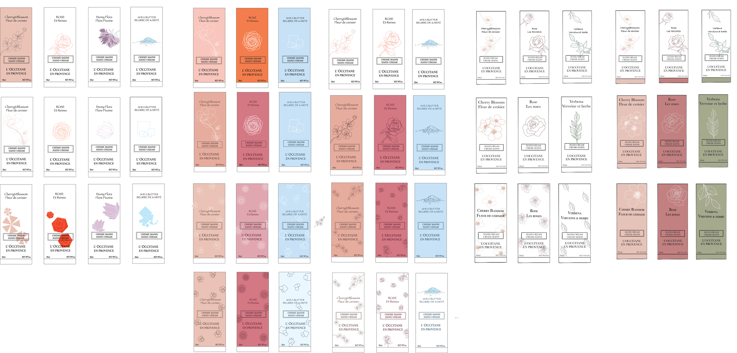
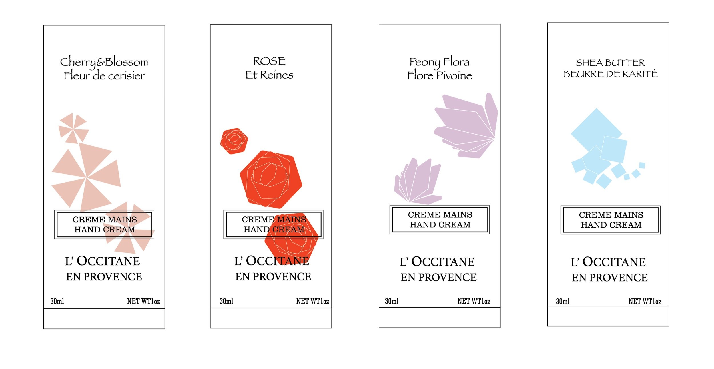
Chosen Layout
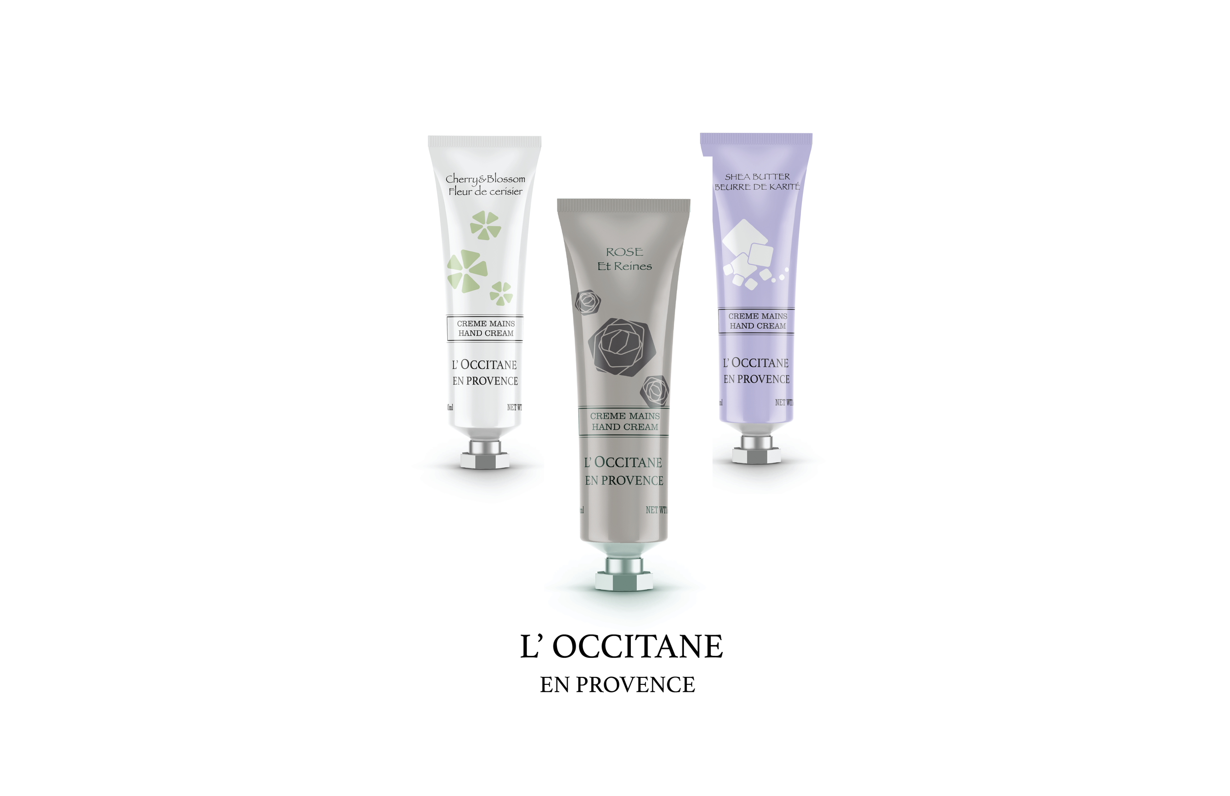
COLOUR TESTING
We researched the colour palettes that’s user friendly to colour blindness group and chose the one that matched the scents. After applying the colour simulations, we picked out the most recognizable one for our final solution.

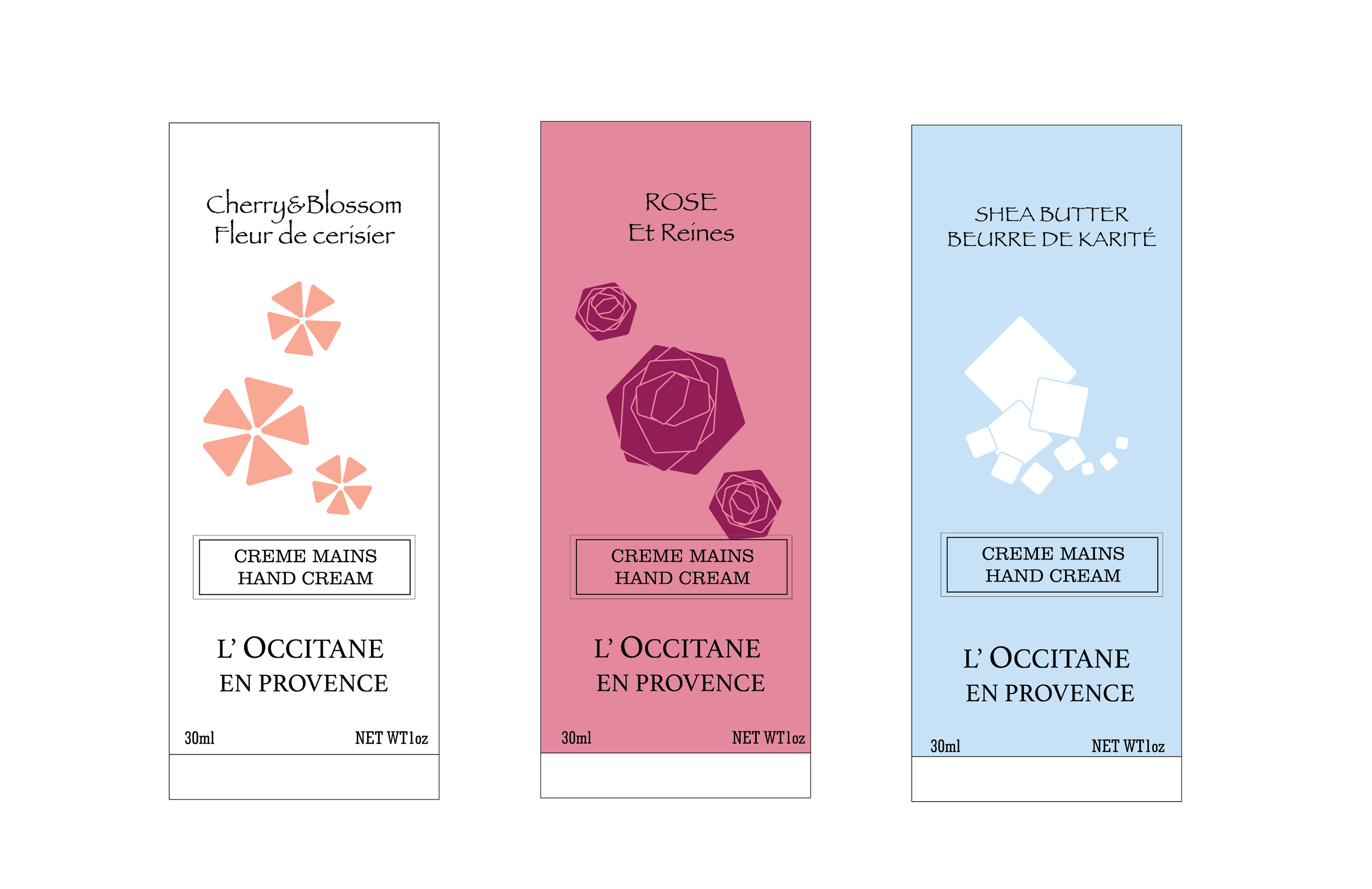
Final visual choice
DIELINE

Simulation