GIFTED
Pet treats packaging design
TEAM
YICHENG WANG
YING YING
Marketing research of pet foods
Developing brand positioning
Developing design brief
Iteration of visual logo design
Design expectations
Visual layout testing
Printed layout with dieline
Marketing research of pet treats
Brainstorming of brand positioning
Build up branding with design brief
Initial brainstorming of logo
Visual layout testing
Printed layout with dieline
Product Rendering

INSPIRATION
Our team choose pet snacks because it is interesting that the consumers we target are not pets themselves, but rather than the pet owners. We think the process of discovering and exploring the owner’s psychology towards pets will help us learn how to perceive consumers’s needs and want.
DESIGN BRIEF
-
Pet Foods PRODUCT: Pet treats
-
Our brand concerns the healthy diet of domestic pets. We are dedicated to providing high quality, vegan, low-calorie and high protein pet foods that help to maintain the wellbeing of our loved ones. Our supplies are oven-baked in small batches with only the highest quality, natural, and sustainable ingredients. We hope to combine high-quality food processing technology with nutritionally balanced scientific ratios to maintain the health of pets and shape a good immune system.
-
Our brand promotes healthy vegetarian diet and scientific pet feeding and is committed to a healthy lifestyle of pets.
-
Vegan, Healthy, high quality, minimal
-
Vegan, Low-calories, Healthy, Nutritional
-
The pet owners who wanna improve the diet of their pets which might experience health problems like obesity and immune deficiency.
-
Vegetarian pet owners or those who have preference of vegetable diet or pet feed- ing and wish to offer healthy diets to their pets.
-
Social Media--The promotion among social media could be fast-spreading the specialist and upsides of vegan, low-calorie pet food could bring them a healthy body.
BRANDING NAME
GIFTED: Having exceptional talent or natural ability
Owners usually reward their pets with a small snack after they make a specified action, “gifted” expresses both the compliment to the pet’s intelligence and the implication that the pet is a gift to us. These domesticated animals bring people not only physical companionship but also spiritual support. We hope gifted conveys a sense of gratitude for the existence of pets, who are not born to serve us, but are a special gift.
Iteration of logo
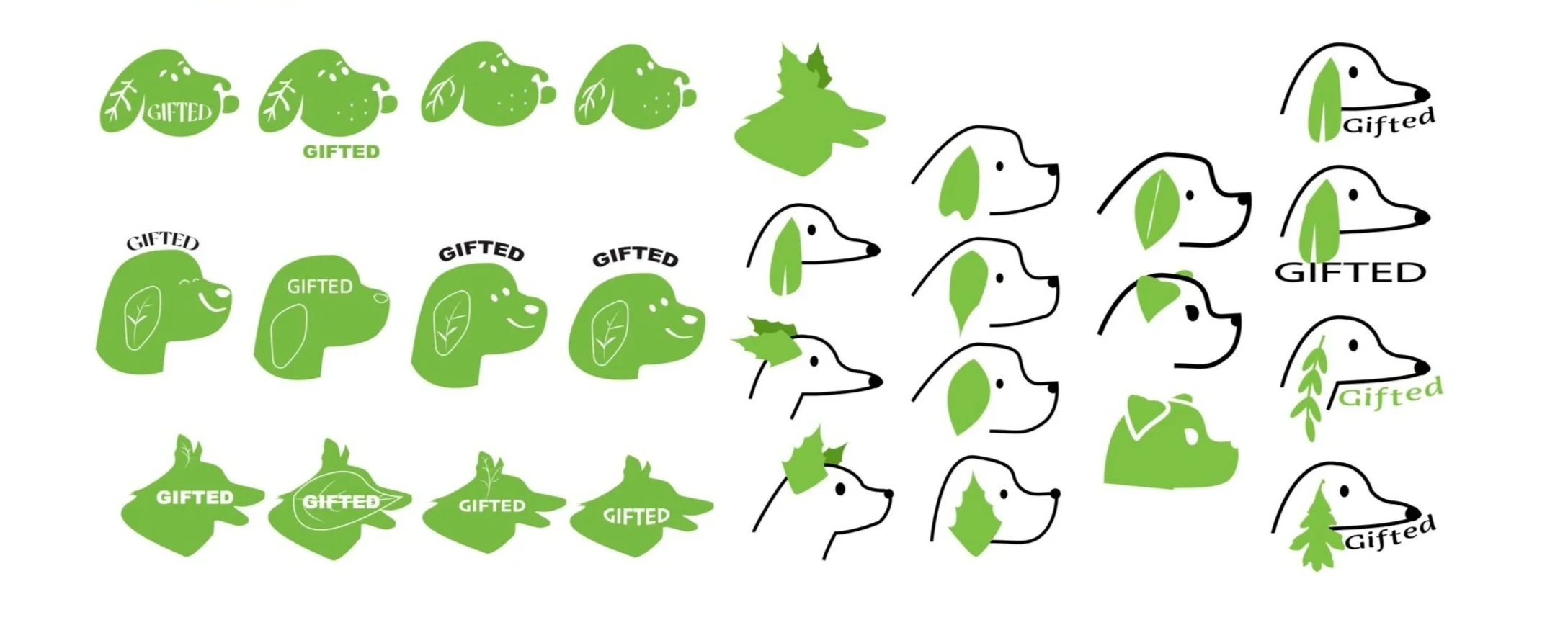
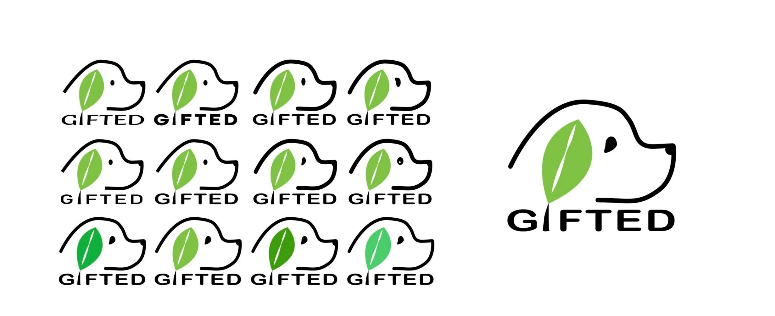
This logo aims to emphasize the connection between the image of the dog and the plant by designing the ear as a leaf. The details of the leaf veins are closely linked to the impression of nature in the human mind, while the outline of the dog’s head points to the fact that the product serves canine pets. The application of green further deepens the branding of the healthy diet.
DESIGN EXPECTATIONS
Must
Visual communication of healthy pet food, minimalist aesthetic
Packaging must be of food grade substrate
The structural forms allow users to repeatedly access the content
Meets the bilingual requirement in the Canadian market
Show essential information like nutrition facts
Should
Use sustainable substrates since the existing packaging forms are mostly
Reduce the use of plastic, which are not eco-friendly
Portable, easy to carry with
Offering various flavours
Could
Available in a choice of pack sizes
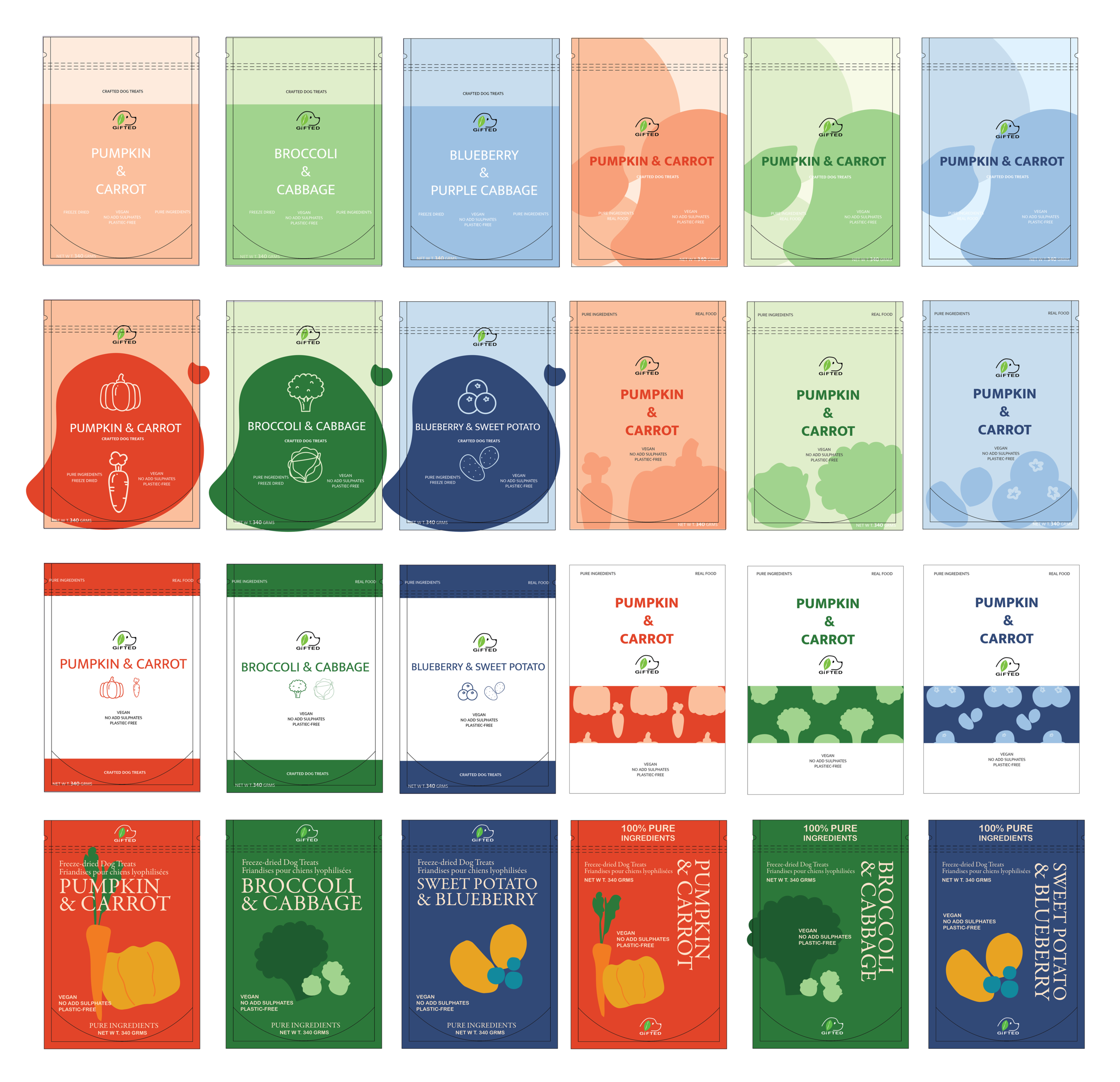
LAYOUT ITERATION
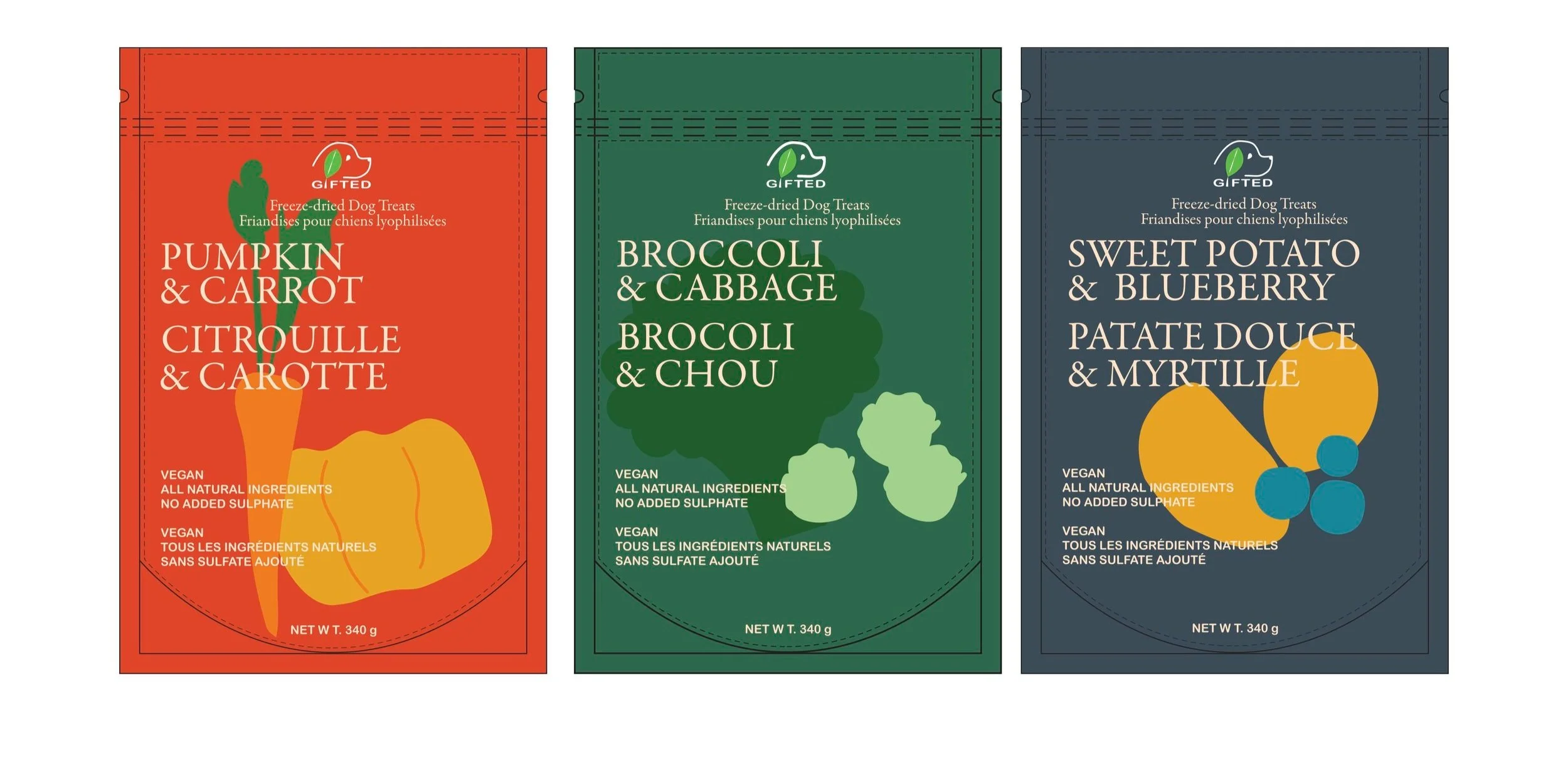
FINAL LAYOUT
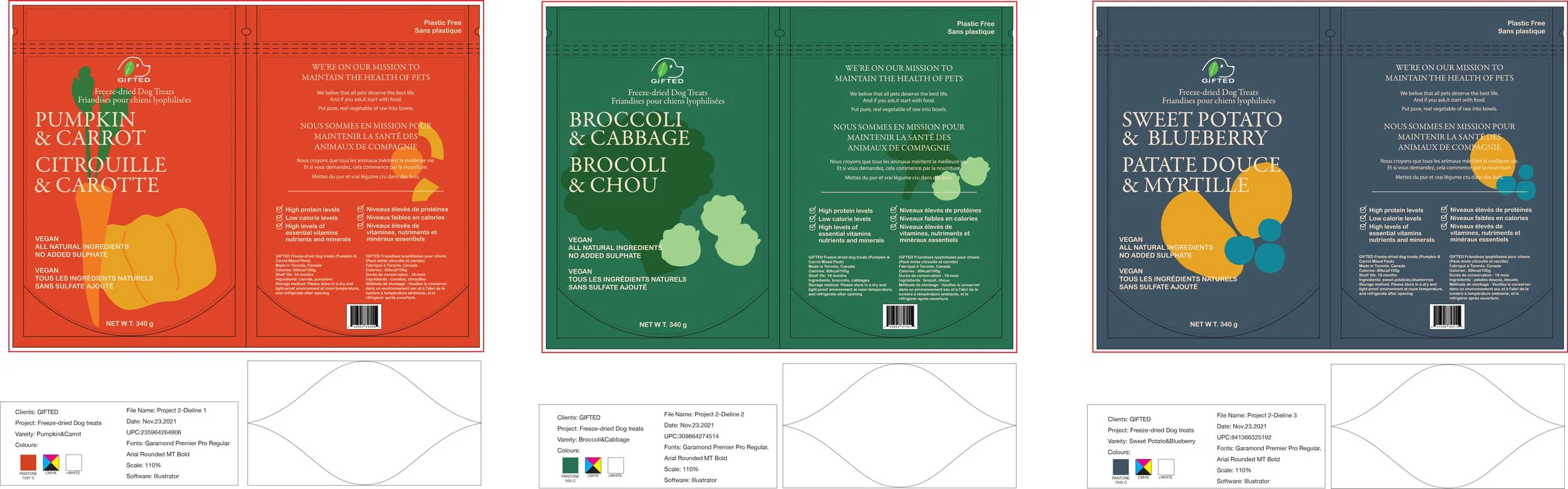
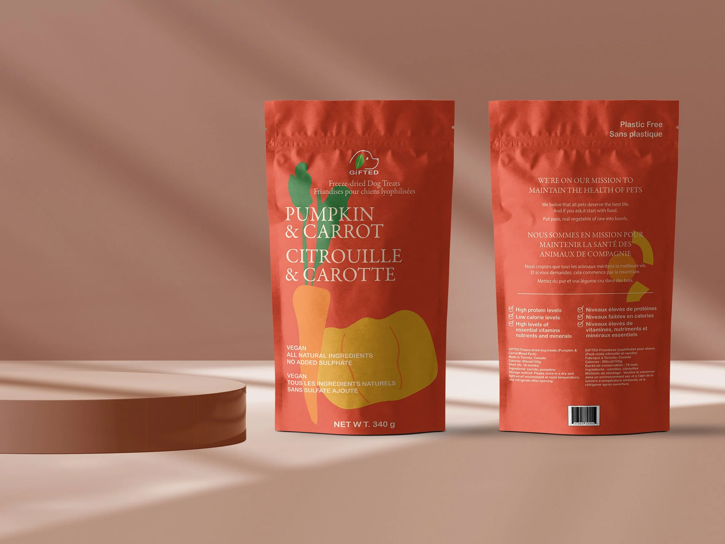
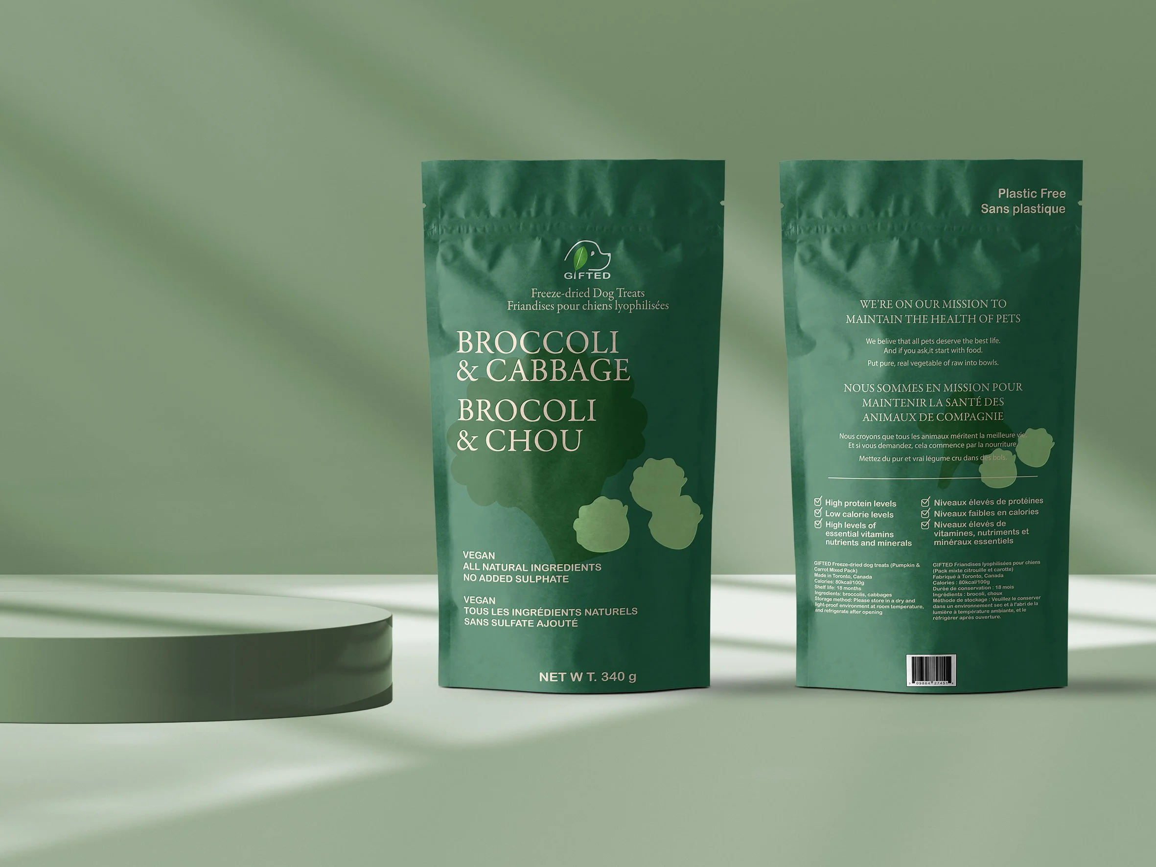
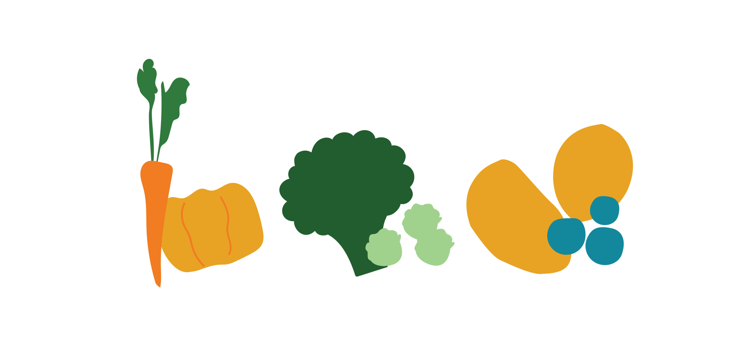
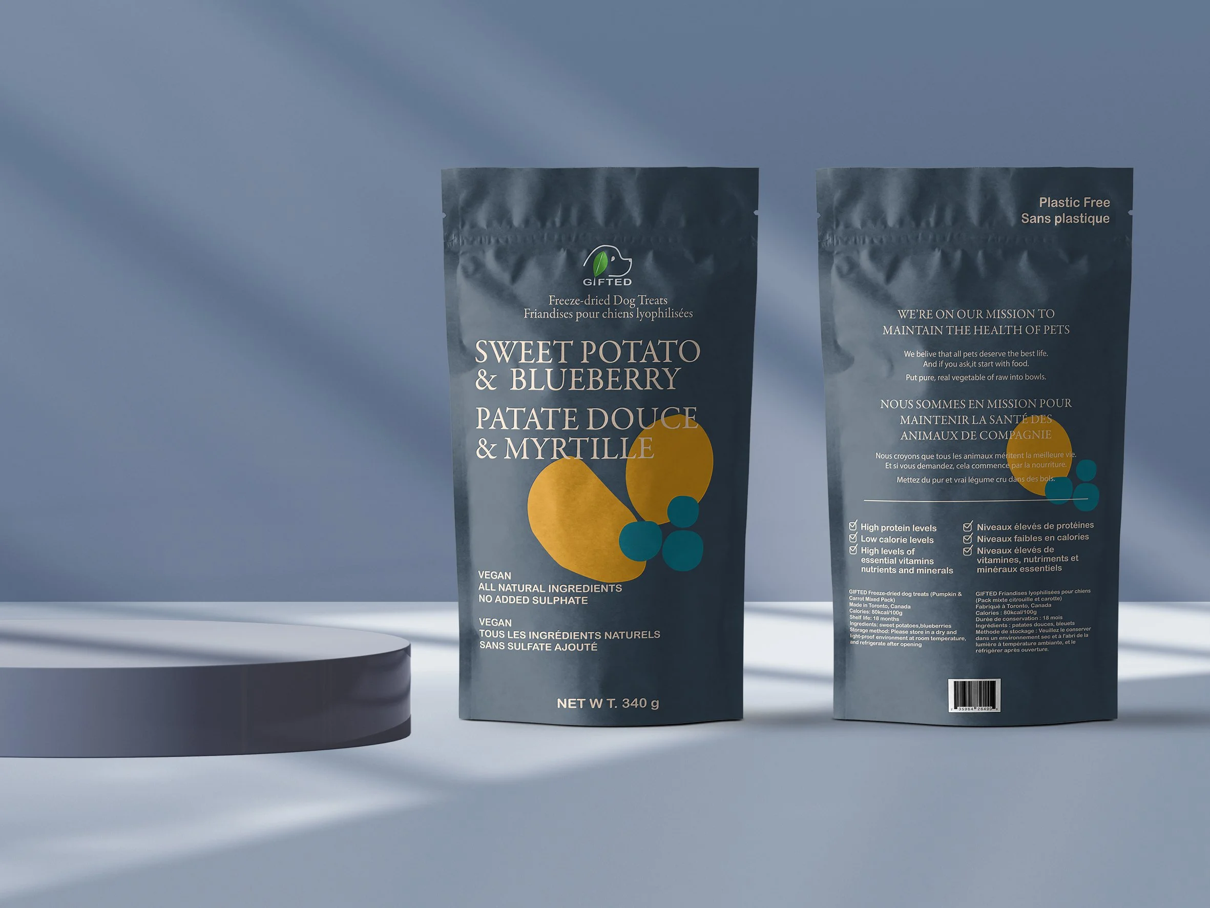
We tried to use a simplified language to appeal to consumers and communicate our green and sustainable branding philosophy. The food ingredients are displayed with flat elements (reduce the outline), the colour palette comes from the colour of the ingredients, and further shows the concept of our brand: vegan, low-calorie, healthy diet.
PRINTED LAYOUT